Have you learned that kitchen color choices can actually increase your home’s value by up to 5%? I’ve learned that the right palette does more than look good; it changes how your space feels.
Whether you’re drawn to calming neutrals or bold statement islands, I’m about to show you five powerful schemes. But here’s what surprises most people: the finish you choose matters just as much as the color itself.
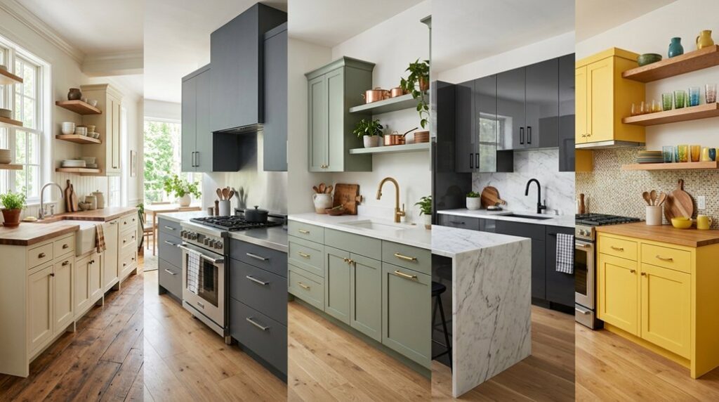
Timeless Neutrals: Whites, Grays, and Greiges

Why do so many kitchen designers keep coming back to white, gray, and greige? I’ll tell you: they’re the ultimate foundation for any kitchen color schemes. White makes small spaces feel bigger and brighter. Grays and greiges hide smudges better and add serious depth without feeling bland.
Here’s what I love about these timeless neutrals: they work everywhere. Paint your walls soft cream, choose gray cabinetry, and add a greige backsplash. They complement quartz countertops, natural wood, and brass fixtures beautifully. You’re not stuck with one look either.
Vary your finishes by trying eggshell walls with satin cabinets for dimension. These neutrals create a calm, welcoming kitchen that feels carefully planned and connects your whole space together.
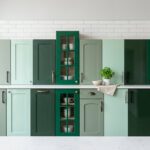
Make Kitchen Islands Your Bold Color Statement

Now here’s where you can break free from all that neutral calm. Your kitchen island color can become the bold accent that ties your whole space together. I’m talking dark hues in small spaces: think Aegean Teal, Tarrytown Green, or Kendall Charcoal. These beautiful shades create a focal point without overwhelming everything around you.
Your kitchen island color can become the bold accent that ties your whole space together without overwhelming everything around you.
Here’s my strategy for making it work:
- Pair bold island colors with lighter walls to maintain visual balance
- Use satin or semi-gloss finishes for depth and durability
- Let your color-framed island delineate zones in open-plan kitchens
- Keep upper cabinets light to prevent heaviness
- Position your kitchen island color where it naturally draws the eye
You’re not just painting furniture. You’re claiming your space and inviting others into your design story.
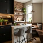
Layer Cool Tones: Green and Blue Palettes for Modern Kitchens

If you’re ready to create a kitchen that feels calm and contemporary, cool greens and blues work beautifully. I love layering cool tones because they bring instant visual interest to any space.
Start with muted greens like Sage on your walls or blue cabinetry for a soothing backdrop. Pair these with soft whites to keep things bright and airy. Then add navy blues or Aegean Teal on your island or backsplash for bold contrast.
Here’s my trick: balance those cool tones with warm metallic accents. Brass hardware and natural wood details prevent your kitchen from feeling too cold. I always choose satin finishes on cabinets because they enhance green and blue palettes beautifully.
The result is a modern kitchen that feels welcoming and sophisticated. You’ve created your sanctuary.
Paint Your Kitchen Black and White for Contrast

Black and white kitchens hit different. I’m telling you, this classic combo creates instant drama and modern style that works everywhere. You’re getting a timeless pairing that stays elegant across any space.
Here’s what makes this kitchen color scheme work so well:
- White cabinetry paired with black countertops delivers serious contrast and visual punch
- Checkerboard floors or herringbone backsplashes add depth without cluttering your monochrome palette
- Metallic accents in gold, brass, or silver enhance the entire design effortlessly
- Mixing finishes, like matte cabinetry with glossy tile, creates texture and interest throughout
This scheme adapts beautifully across contemporary and traditional styles. I’ve found that varying black and white shade intensities lets you customize everything based on your lighting and space. You’re not locked into one look. Your kitchen becomes a distinctive design choice that feels uniquely yours while staying timeless and elegant.
How Paint Finish Changes Kitchen Color Perception

Ever notice how the same white looks totally different on your kitchen cabinets versus your walls? That’s because paint finish affects how we perceive color! I’ve learned that satin finishes reflect light beautifully, making my cabinetry feel deeper and more substantial than flat sheens. Glossier surfaces bounce light around, brightening spaces, while matte finishes absorb it for softness.
Here’s my favorite discovery: pairing satin kitchen cabinetry with eggshell walls creates excellent dimension without looking mismatched. The color warmth shifts too; satin makes whites appear crisper, while matte versions feel cozier. Plus, satin offers serious durability advantages for busy kitchens.
When I applied this principle to my paint sheens, everything changed. Same colors, different finishes, completely different vibes. You’ll notice the difference immediately, I promise.